Engagement Strategy Explanation Sheet
Week 3 – Media Playbook | Chan Robinson
PLAY 01
Visual Hierarchy
WHAT
This strategy focuses on how information is visually prioritized so the viewer naturally knows where to look first.
HOW
I used large, bold titles for the main ideas and kept supporting details clearly organized underneath. Each section follows a consistent structure so nothing feels random or out of place.
WHY
When the layout does the work for the viewer, they don’t have to think as hard about where to focus. This makes the content easier to understand and keeps them engaged longer.
PLAY 02
Chunking Information
WHAT
Chunking is about breaking information into smaller pieces instead of presenting everything at once.
HOW
Instead of long paragraphs, each idea is split into WHAT, HOW, and WHY sections. This keeps everything short, structured, and easy to follow.
WHY
People process information faster when it’s organized into smaller parts. This makes it easier to read, remember, and actually apply.
PLAY 03
Color & Contrast
WHAT
This strategy uses color and contrast to make important information stand out.
HOW
I kept the base design clean and mostly black and white, then used blue and pink accents to highlight key areas and guide attention.
WHY
Strong contrast makes content easier to scan and prevents everything from blending together. It helps the viewer quickly pick up on what matters most.
PLAY 04
Interactivity
WHAT
Interactivity gives the user control over how they move through the content.
HOW
The flipbook format allows users to click through each page at their own pace instead of being forced into a fixed sequence.
WHY
When people actively interact with content, they stay engaged longer and are more likely to remember what they’ve seen.
PLAY 05
Relatability & Tone
WHAT
This strategy focuses on making the content feel familiar and relevant to the audience.
HOW
I used a playbook-style structure and direct, conversational language so the advice feels practical rather than overly formal.
WHY
When content feels relatable, people are more likely to connect with it and actually apply what they’ve learned.
Engagement Strategy Explanation Sheet
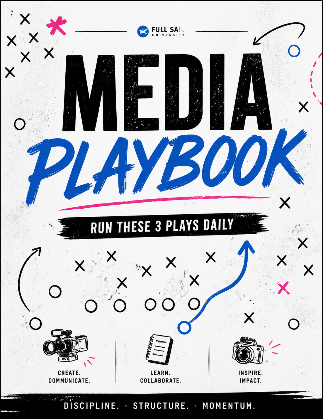
In the design of my media playbook, I intentionally applied several engagement strategies to make the content more effective, readable, and relevant to the target audience of new Intro to Media Communication students.
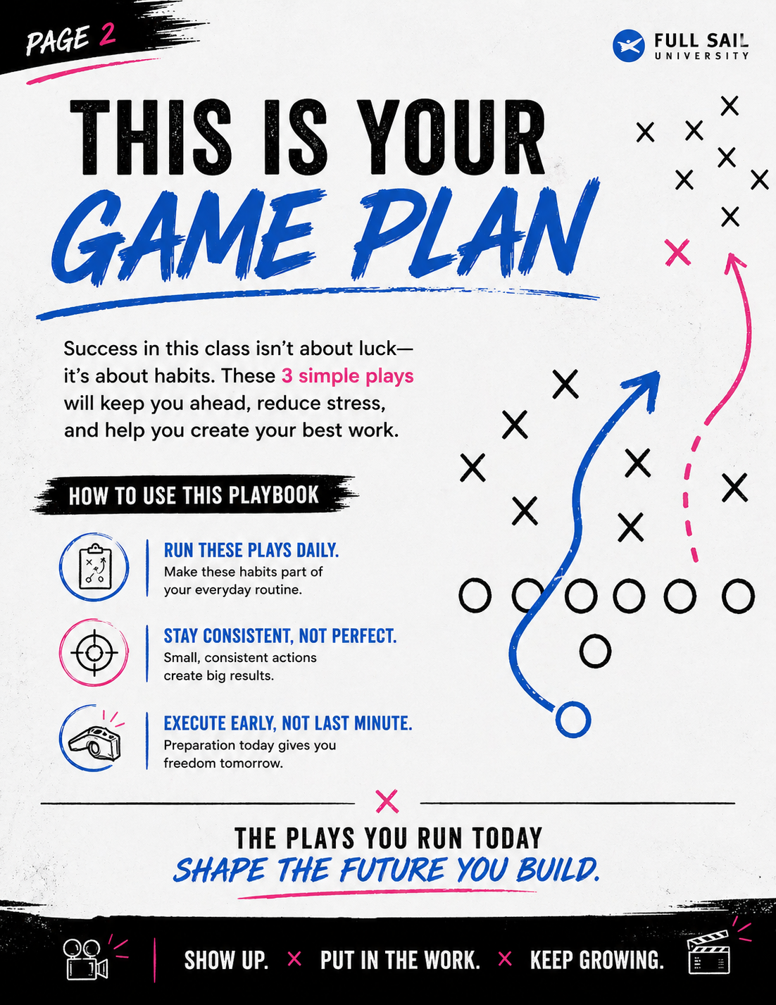
The first strategy I used was visual hierarchy. This involves structuring content in a way that naturally guides the viewer’s attention. I applied this by using large, bold titles for the main ideas and placing supporting information in clearly organized sections beneath them. This allowed viewers to immediately understand what each page was about without needing to search for meaning. This approach is effective because it reduces confusion and cognitive effort, which aligns with course concepts emphasizing clarity and guided attention.
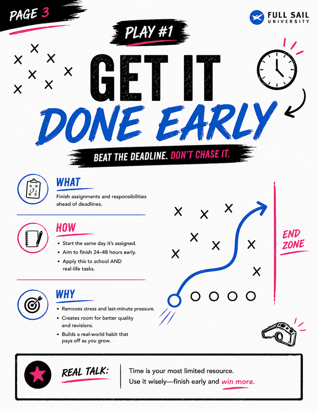
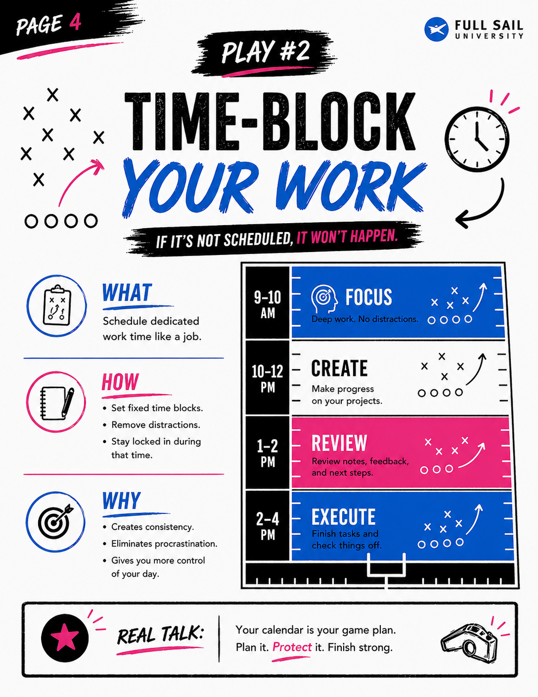
Another key strategy used was chunking information. Instead of presenting ideas in long paragraphs, I broke each concept into three clear sections: WHAT, HOW, and WHY. This made the information easier to follow and less overwhelming. By organizing content into smaller, structured parts, users can process and retain information more efficiently. Course materials highlight that learners engage better with content when it is segmented into manageable pieces, and this structure supports that principle.
I also applied color and contrast to help emphasize important elements. The design uses a mostly black-and-white base, with blue and pink accents to highlight key phrases and guide the viewer’s focus. This creates a clear visual distinction between sections and prevents the content from blending together. Strong contrast improves readability and makes it easier for users to scan the page quickly, which is especially important in a visual format like this. This aligns with course concepts that emphasize accessibility and visual clarity as critical components of engagement.
Interactivity was another important strategy in this project. Instead of presenting the content as a static document, I created a flipbook format that allows users to click through the pages at their own pace. This gives the viewer a sense of control over their experience, rather than forcing them to consume information in a fixed way. Interactive content tends to hold attention longer and encourages active participation, which improves retention. This reflects course ideas that emphasize the importance of user involvement in effective media design.
Finally, I focused on relatability & tone to make the content feel more relevant and approachable. The playbook uses a structured, sports-inspired format and conversational language such as “run these plays daily” to connect with the audience in a familiar way. Instead of sounding overly formal, the tone is direct and practical, making the advice feel usable in real-world situations. This is important because audiences are more likely to engage with and apply content that feels relevant to their own experiences. Course materials emphasize that tone and relatability play a major role in maintaining audience interest and building connection.
Overall, each of these strategies was intentionally applied to improve clarity, engagement, and usability. By combining visual structure, organized content, thoughtful use of color, interactivity, and relatable tone, the media playbook was designed not just to present information, but to make it easier for students to understand and apply what they are learning.